museum

Rijksmuseum by hugo keene

Location: Amsterdam, South Holland, Netherlands
Architect: PJH Cuypers/Cruz y Ortiz Arquitectos
Completed: 1885/2012

15 Photographs

The first time I visited the inside of the Rijksmuseum, we just happened to be in Amsterdam on the weekend it re-opened, after one of the longest and most publicly awaited renovation projects in Dutch history. Since I first visited the city, it had always been closed and sat quietly at the head of the Museumplein, the mix of gothic and renaissance themes intimately familiar to anyone who has spent time in the Netherlands yet presented with a composition and grandeur unmatched in the city. In a city like Amsterdam, so overflowing with great buildings and interesting things, it was easy to overlook the dark quiet stranger at the end of the park. Being designed by the same architect as the Amsterdam Centraal Station, which followed the Rijksmuseum, the two distinctly similar buildings sit at either end of the old city like an old pair of bookends, romantic revivalist celebrations of Golden Age.

I always loved the story that of the many delays and issues encountered in the renovation project, one of the most hotly contested, was down to a desire for the inhabitants of the city, to be able to continue to cycle through an existing road through the middle of the ground floor of the museum instead of around it as initially proposed. I’ve been a cyclist, in a cyclist’s city and I feel very deeply that it’s a thing that should be encouraged and protected at all costs, especially the majesty and dignity of the cyclist’s experience when it is seamless, safe, and relatively direct.

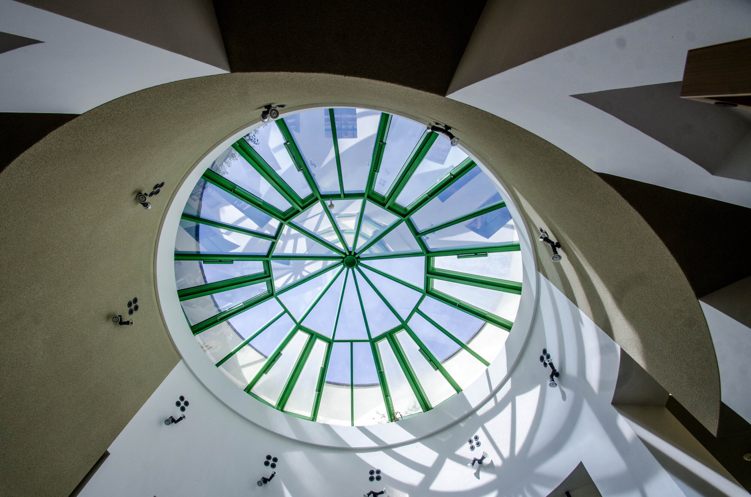
The renovation of the Rijksmuseum is brilliant. As an afficionado of fine architecture, I’ve visited many museums of the world, a building typology that would be the centrepiece in any architect’s portfolio and one of the crux architectural problems of any young architect in training, be that right or wrong. The solution here is particularly clever in overcoming the challenging problem of how to provide contemporary visitor standards and architecture, within an examplar historical building. By dropping the entry concourse below and under the road, and covering the whole courtyard with a deep, layered set of roof structures, this allows for a generous entry space filled with dappled light, while allowing the functional back of house relating to entry and security to tuck neatly under the stairs, without disrupting the existing gallery programme above. This alows the gallery spaces to function more or less as originally intended while adding a stack of new space. The original courtyard feels like it is simply dropped down and draped across the functional requirements of the building. The cycleway through the building and the campaign to retain this thing of value to the cyclist city (citizen) has been a positive design contribution rather than a constraint.

Despite the radical adjustment to the conceptual diagram of the museum, it retains much of the qualities of the 18th-century building, with the new parts fitting neatly in with the old, each part feeling familiar and unimposing on the next. The existing spaces themselves are beautifully restored and the new insertions meticulously placed and considered, such that it is not immediately apparent where the junctions are between old and new.

There are many good museums around, I have visited quite a few and waxed lyrical about some, but the Rijksmuseum is up there as one of the most interesting and unique of them. It rightly sits comfortably at the heart of a city and in the heart of its citizens.

HWLK

Kimbell Art Museum by hugo keene

Location: Fort Worth, Texas, USA
Architect: Louis Kahn
Ccompleted: 1937

15 Photographs

There is something timeless about the Kimbell Art Museum, almost like it could be a hundred years old, or a thousand, the way it rises out of the earth like a stone formation, left alone by the hand of the wind. It has a character quite suited to becoming a ruin, and will no doubt be a highlight in post-apocalyptic tours of the Dallas-Fort Worth metropolitan area if it survives the churn.

Henry and I had come to Texas at the end of a long road trip through the deserts of Arizona, Utah, and New Mexico and we had experienced many wonderful places, people, and events along the way. Only weeks before, we had stood in Monument Valley, admiring the mesas in the dusty purple evening light after dusty day on the road. Having lived as desert rats for the weeks leading up, it is no surprise that when we come to talk about the Kimbell so many years later, Louis Kahn’s masterpiece evokes a similar kind of connection to this place for the both of us.

In the days after our visit, Henry described it as ‘The most complete building, I have ever visited’. In the years before and since, I have seen a lot of concrete buildings, old and new, from the good to the great and all the way down to the terrible. I have been involved in the construction of a few of our own as well. Amidst all of this, I still can’t think of another building that compares. There is a level of craftsmanship in the Kimbell that makes it feel like a piece of furniture as much as a building, and when you understand how in-situ concrete of this type is made, this makes perfect sense. To make a building like this, the liquid concrete is poured into a negative formwork, made of steel or timber, and then that formwork, almost like a cabinet shell itself, is stripped away to reveal the concrete.

I have always been intrigued by how we as humans inhabit the desert. It is such a hostile but beautiful place and from Sedona to Uluru, humans have struggled with how to inhabit the hot dry parts of the world, providing protection from the elements, and embracing the beauty. There is a lot of learning from those attempts in the result at the Kimbell, both in the form of the building and its response to the elements. Like all desert dwellings, the primary objective is to bring in the light, while protecting from the sun and in doing so, this is the great success of the building, above anything else. The way the ceiling vaults reflect light is just divine, the shape and finish carefully crafted to express this as primary to the function of the building.

Like all profound artistic works, the Kimbell Art Museum feels simple enough to be drawn by a child. An architect I admire once claimed that good architecture is obvious in retrospect because where it is successful, it is drawn out of its context in such a way that it feels almost inevitable. The Kimbell is a building that does this, a perfect example of Oliver Wendell Holmes concept of ‘the simplicity the other side of complexity’, sitting neatly at the intersection of a mud hut and a Stradivarius.

HWLK

QN-ArchiPhoto-Kimbell-14.jpg
QN-ArchiPhoto-Kimbell-16.jpg
QN-ArchiPhoto-Kimbell-17.jpg
QN-ArchiPhoto-Kimbell-10.jpg

Musée Soulages by hugo keene

Location: Rodez, Aveyron , France
Architect: RCR Arquitectes
Completed: 2014

11 Photographs

Sometimes a building arrives as surprise, a random part of another adventure entirely. We had driven from the top of France to the bottom to visit some friends a few days previously and had quickly adjusted to the uptick in cheese and bread consumption. I would not say I have travelled extensively in France, but a healthy majority of that has been exploring cities or wandering the countryside looking for buildings, and already this trip we’d seen some delights old and new.

I had first heard of RCR Architectes some years beforehand, when an architect friend with whom I was collaborating was ruminating on the blackened steel panels lining the inside. At the time, we only looked at some photographs of that part of the building at the time and so I knew very little about it. That day we journeyed to Rodez specifically, to visit the gallery and restaurant for that same friend’s birthday, and after a spectacularly good and uniquely French meal, we walked through the museum grounds and the gallery itself.

As is obvious from the pictures, this was the perfect kind of day to wander around this building. The scattered clouds providing a pale muted backdrop against the faded green summer grass and the earthen red of the weathering steel. It is a beautifully simple building, in both form and function, perched on the edge of a green strip, overlooking the city.

The gallery itself contains only the work of the artist for which it is named, Pierre Soulages, whose work seems to my untrained eye to be at the intersection between painting and sculpture. Perhaps it is what you might call physical painting, exploring texture and material and graphic in what to me seems like an exciting and abstract way.

I cannot remember another museum that enclosed the work of a specific artist with quite the same effortless poise as the Musée Soulages does. The beautiful weathering steel box outside, with the blackened steel inside, and the unique work of Soulages lurking in the shadows behind the veil. It really is a marvel. I have heard before of great museums that the curators did not rush to fill because of the drama of the spaces themselves. While this does not feel like that in quite the same way, it definitely feels like neither needs the other, despite belonging together.

HWLK

Casa das Histórias Paula Rego by hugo keene

Location: Cascais, Portugal
Architect: Eduardo Souto de Moura
Completed: 2008

11 Photographs

I have spent many days gazing out into the ocean on Europe and North Africa’s Atlantic coast and it always struck me as a vast exposed kind of ocean. When I look at it on a map that doesn’t make a lot of sense, but in Adelaide, when you look out to the ocean, it never felt that immense to me, despite the fact that the Great Southern Ocean surrounds an entire continent.

In 42 years, out of the 25 times the annual Pritzker Prize has been awarded to someone outside the United States, London or Japan, 2 of those recipients have been from not only the same town in Portugal, but effectively come from the same practice, with the offices of Souto de Moura sitting a floor below those of his mentor and previous boss, Álvaro Siza Viera, whose work was introduced to me by my old boss Kerry. I like the elemental quality of Souto de Moura’s buildings, they remind me of the raw concrete framed post slab buildings that I was surrounded by when I discovered his work while in Singapore. As my travels took me further abroad, I realised that the Mediterranean countries had a similar kind of thing, raw, sometimes unfinished, but beautiful in their simplicity. The Casa das Histórias is a very pure expression of that elemental simplicity, both in terms of the monolithic way it is built and the layout of the spaces. The red hue of the concrete pyramids, sitting within the crisp walled green garden, with the deep ‘bluebird’ sky providing the perfect counterpoint, like an advertising poster for RGB.

One of my great pleasures in life is taking friends to visit extraordinary places and it is the similar but different kind of pleasure when you visit with students, the questions are more informed, but less personal and the element of surprise is different. When you tell most people that that are going to see something amazing, they are sceptical, but architecture students have a special kind of optimism and the good ones at least are yearning for their minds to be opened. I liked this place as an explanatory example of how buildings can be radically different, while being intimately familiar.

As is often the case with buildings like this, we weren’t allowed to take photographs inside the galleries, which is a shame, as the spaces themselves, inverse of the pyramidal forms, have a wonderful quality of light from the apertures at the top.

I have always loved walled gardens and while I usually like something richer than a crisply mowed lawn, I wholeheartedly enjoyed lazing on the lawn within the walls while the students wandered about asking the occasional question. Later, after buying a striped pair of euro style short swimming trunks, a small group of us swum in the chilly vast Atlantic Ocean, then had a beer in the sun.

HWLK

Neue Staatsgalerie by hugo keene

Neue Staatsgalerie - Stuttgart, Germany - Architect: James Stirling, Michael Wilford and Associates - Completed: 1984

12 Photographs

If any building sits at the heart of my fascination with architecture, then the Neue Staatsgalerie is probably it. Not because it’s the best building I’ve visited (it isn’t) or because I particularly love post-modernism (I don’t), but in a similar way to the cemetery at San Cataldo, it came to me at a time in my education when I needed tinder for the lonely sparks of architectural inspiration that I was experiencing.

In my third year at university, I was designing a sunken plaza in Adelaide and my tutor saw my rough model of intertwined shapes and bright colours and sent me off to the library to find this strange fascination he’d described. This was before we had the internet and a hundred images at our fingertips, but after an exhaustive search of architectural books, I found it. As first I was enthralled by the bold colours and exciting geometry, but soon discovered and began to appreciate how the interlocking and interconnected spaces defined the visitors experience of the place by creating possibilities that seemed random, but actually were intimately connected to the building user and their experience.

Despite all this, I had never been in a hurry to visit. Somehow, I knew it would come at some point and it happened organically, while travelling through Germany on a camping holiday. I visited twice, over the course of two days, and the first time I took no pictures nor drew any lines. It was the afternoon, and I walked the place up and down, back to front, inside and out. The next morning, I returned with my camera and took a set of photographs.

It is rare to visit a building and not be disappointed in some way, no matter how exciting or brilliant the building is, but I found it hard to be disappointed by the Neue Staatsgalerie. I knew her faults, like a sometimes irritating old friend that you love at all times regardless, and visiting was a little like coming home. I have visited many buildings before this one and I’m glad I waited, because strangely I don’t think I would have appreciated it like I did.

It was worth the wait.

HWLK